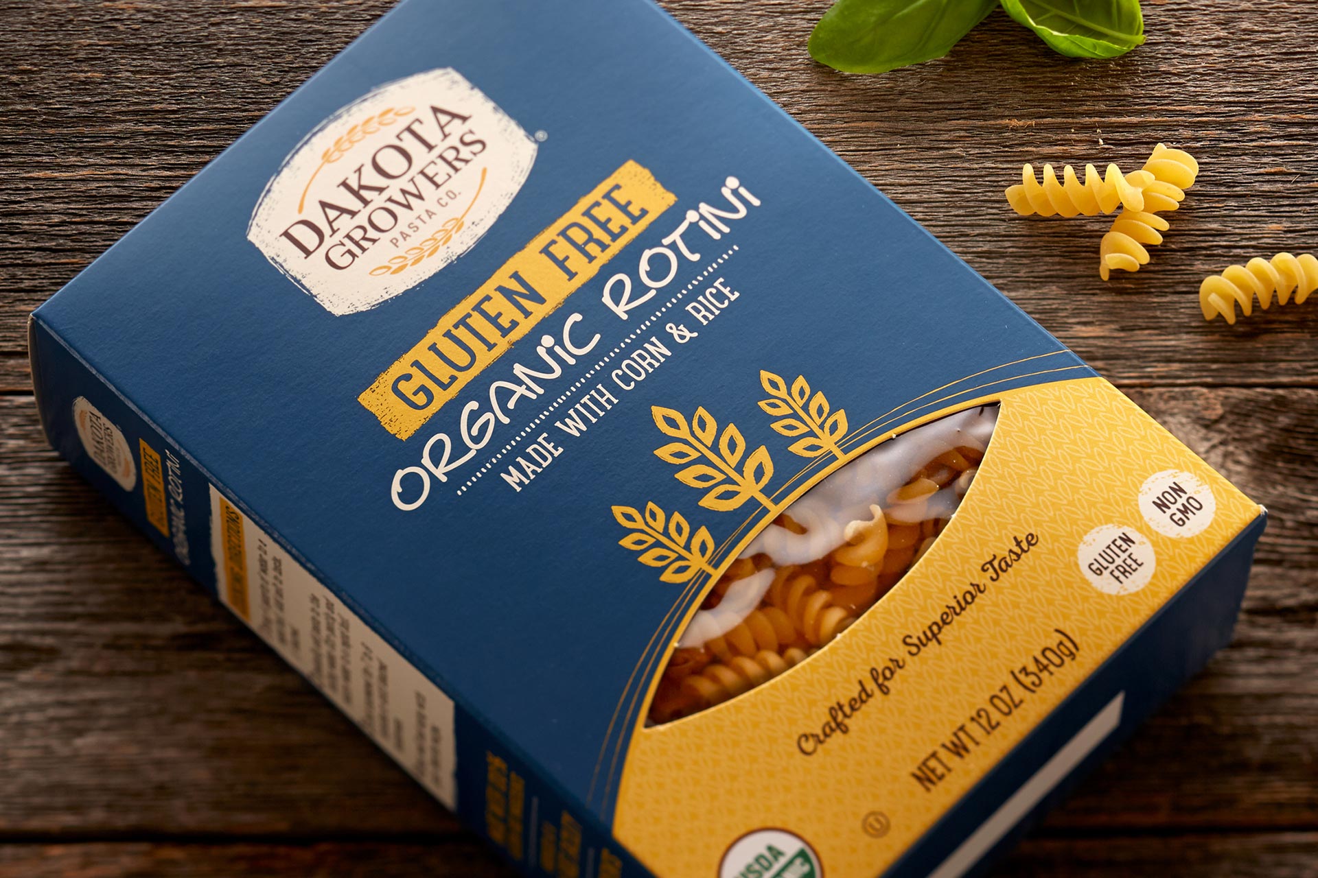
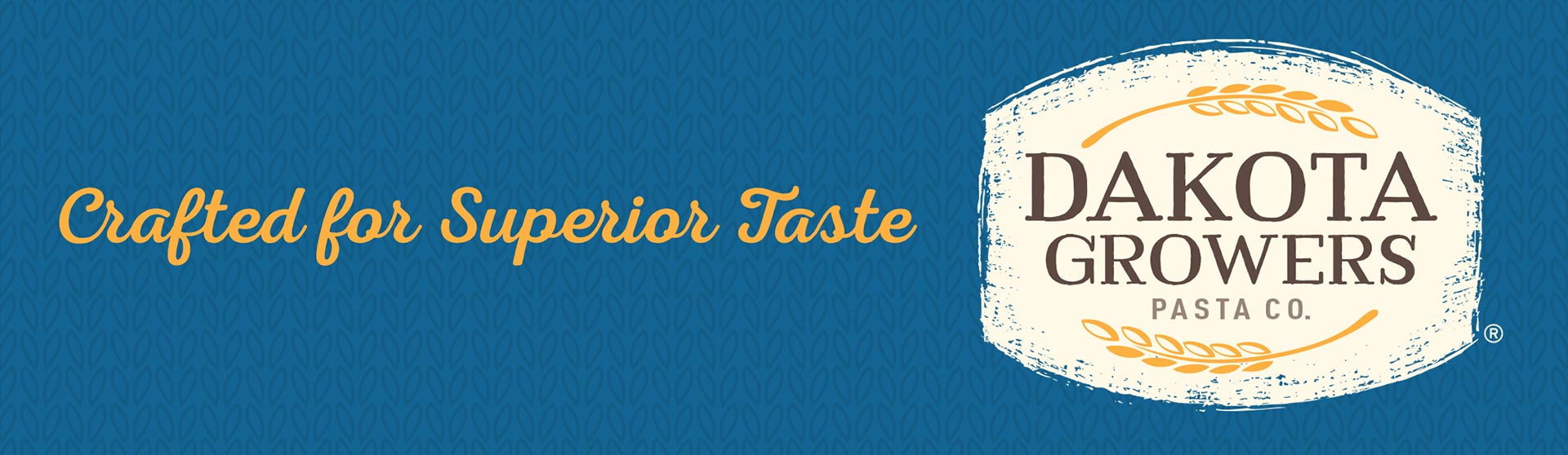
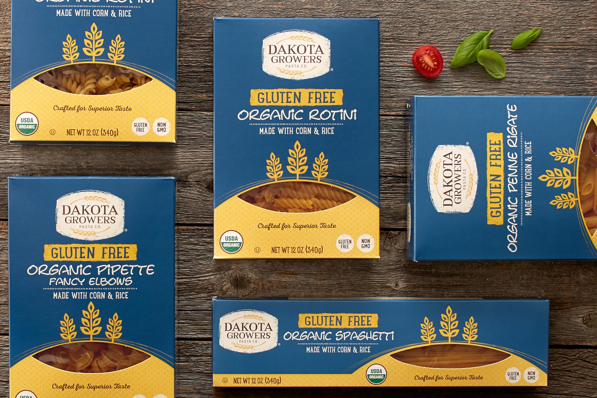
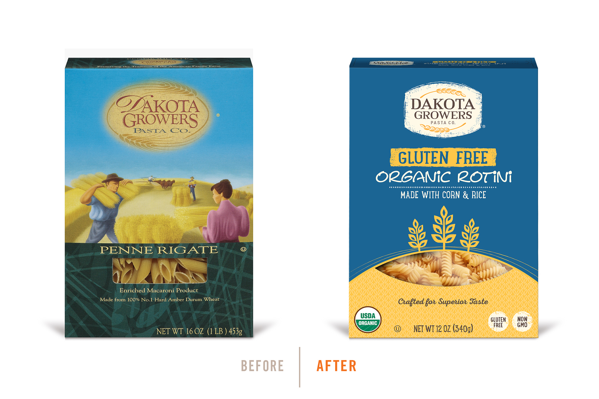
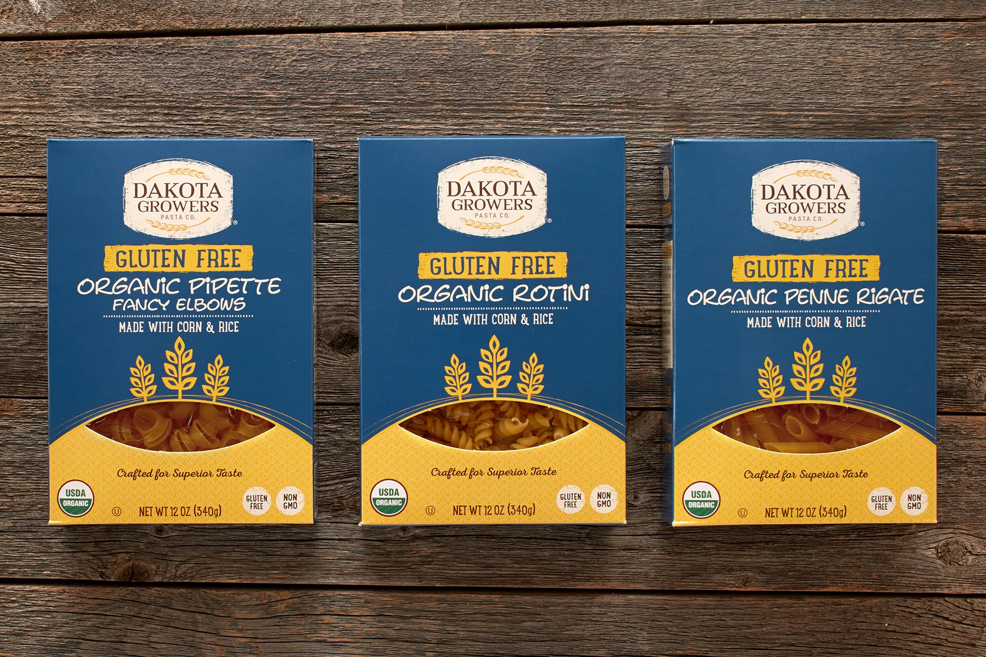
Known and named for being produced and sourced in the midwest, the Dakota Growers Pasta Company brand and package was
ready for an update. We were asked to carefully evolve the brand mark, but completely revolutionize the package itself. The brand
team’s goal for the new packaging was to convey quality, natural ingredients while also communicating a personal, modest and
midwest feel. Our team cooked up a range of solutions with this intent; the end solution striking the perfect balance within the
objectives. Carrying the Dakota Growers sky blue equity and introducing natural textures and handwritten font choices, this humble
but premium line of pasta packaging now pays perfect homage to its namesake.