Take Ownership of Your Brand
Let us handle the heavy lifting for you.

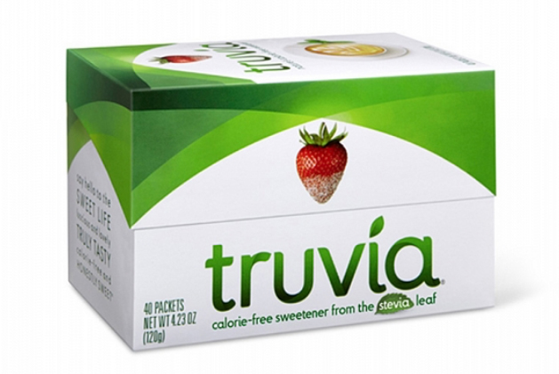
Truvia® was one of the first products of its kind to market in 2009 and is the #1 stevia sweetener brand today. Their portfolio of products has expanded, and they have faced a growing list of competitors. While clean and contemporary, the brand’s essence was missing from the current design; it was ready for a refresh. Our challenge was to bring the Truvia personality to life as well as to educate the consumer that it is a perfect combination of “sweet and smart.”
scroll to see the whole story
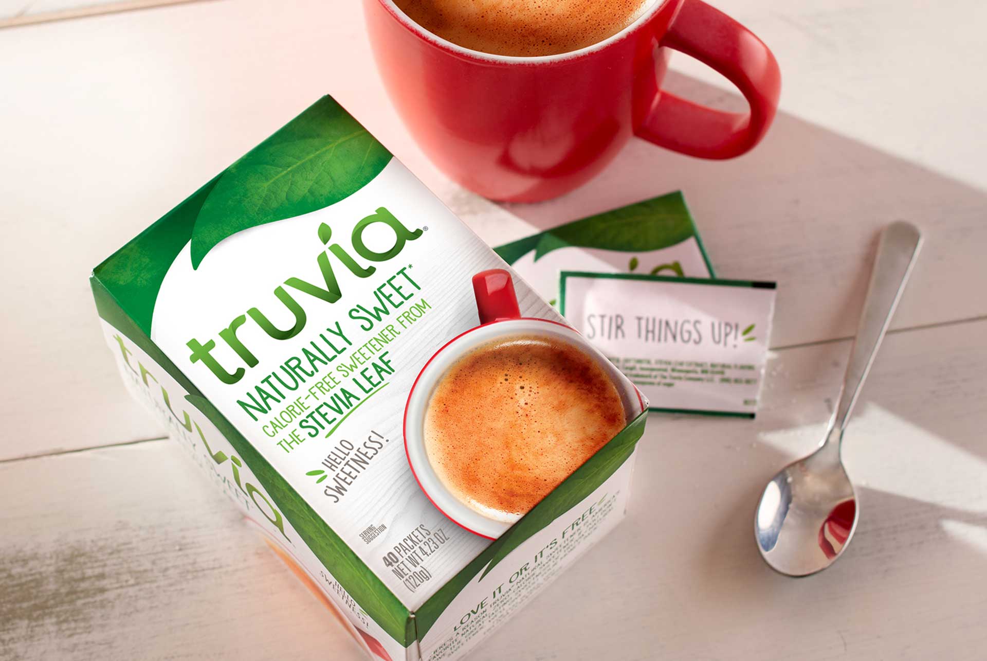
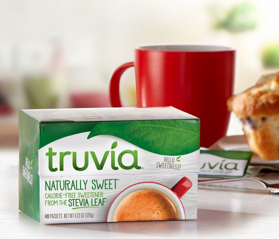
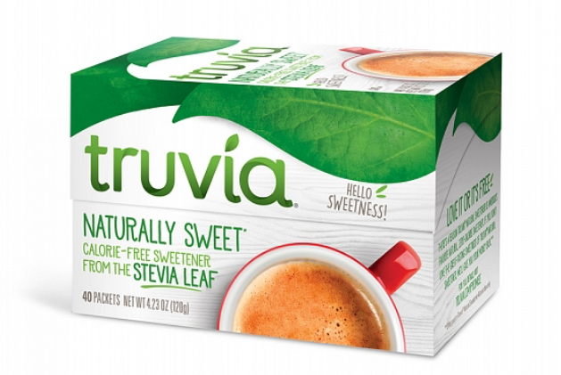
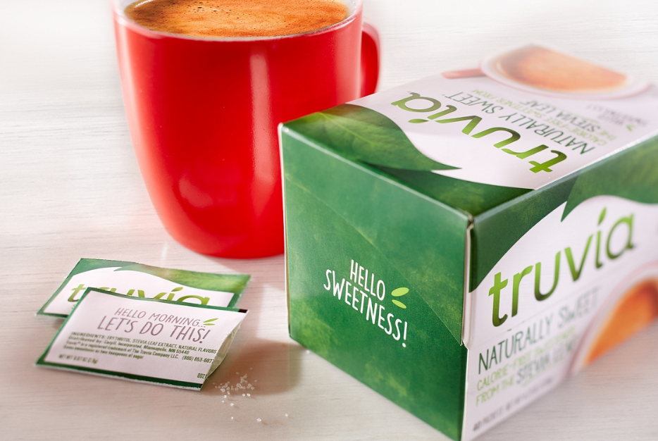
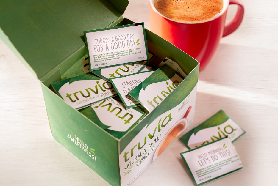
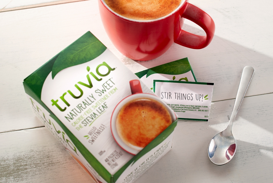
We created a simplified, pleasing aesthetic by flooding an entire side panel with the mottled green color and a simple phrase “Hello Sweetness".
As a daily part of the consumers’ routine, our vision was to create happy, inspiring moments through various wink phrases on each packet.
Allowing for retailer versatility, the design is adaptable, going from horizontal or vertical orientation with ease.

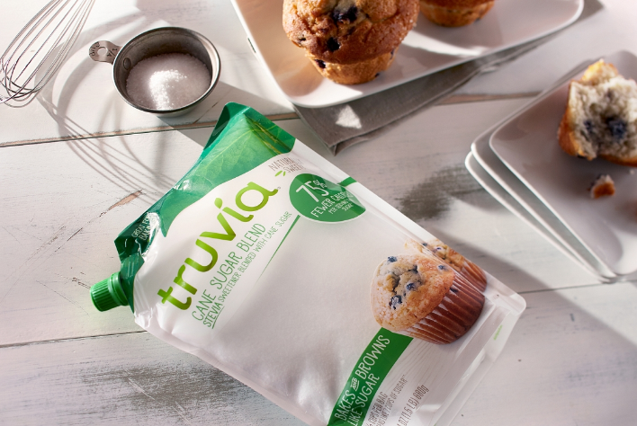
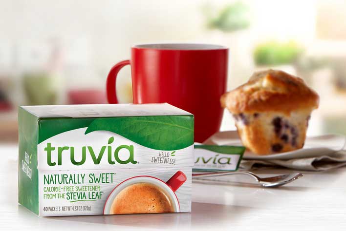
Remaining sensitive to the brand’s equities, Mackey introduced a friendlier consumer experience starting with the arch of the stevia leaf that reinforces the branding to a classic white-washed texture and casual fonts that radiate a warm and approachable feel at shelf. The red coffee mug draws the consumer in an emotional way, adding a pop of red that they were used to seeing on the package. The final accent is a signature Truvia “wink” with fun phrases on the outer packaging as well as an assortment of inspiring quotes on the packets.